Durex - One Night Sans
Global typeface for Durex as part of a wider repositioning.
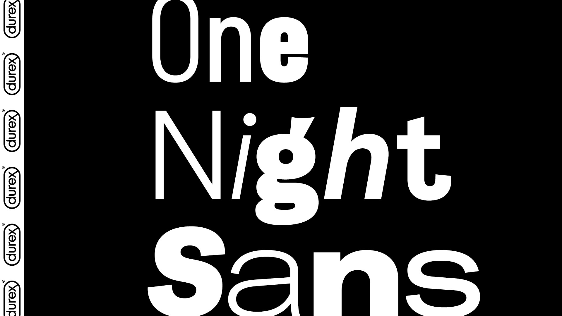
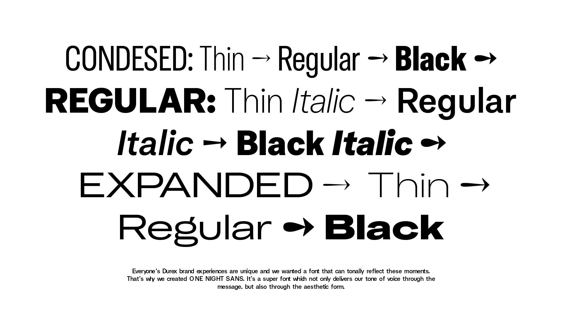
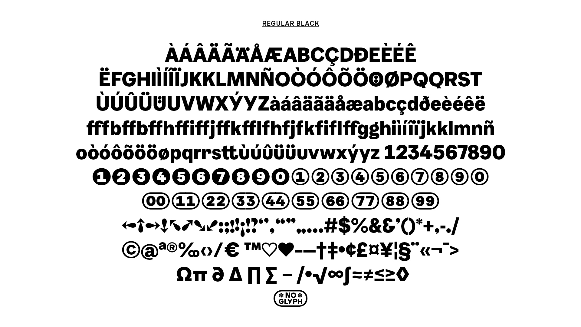
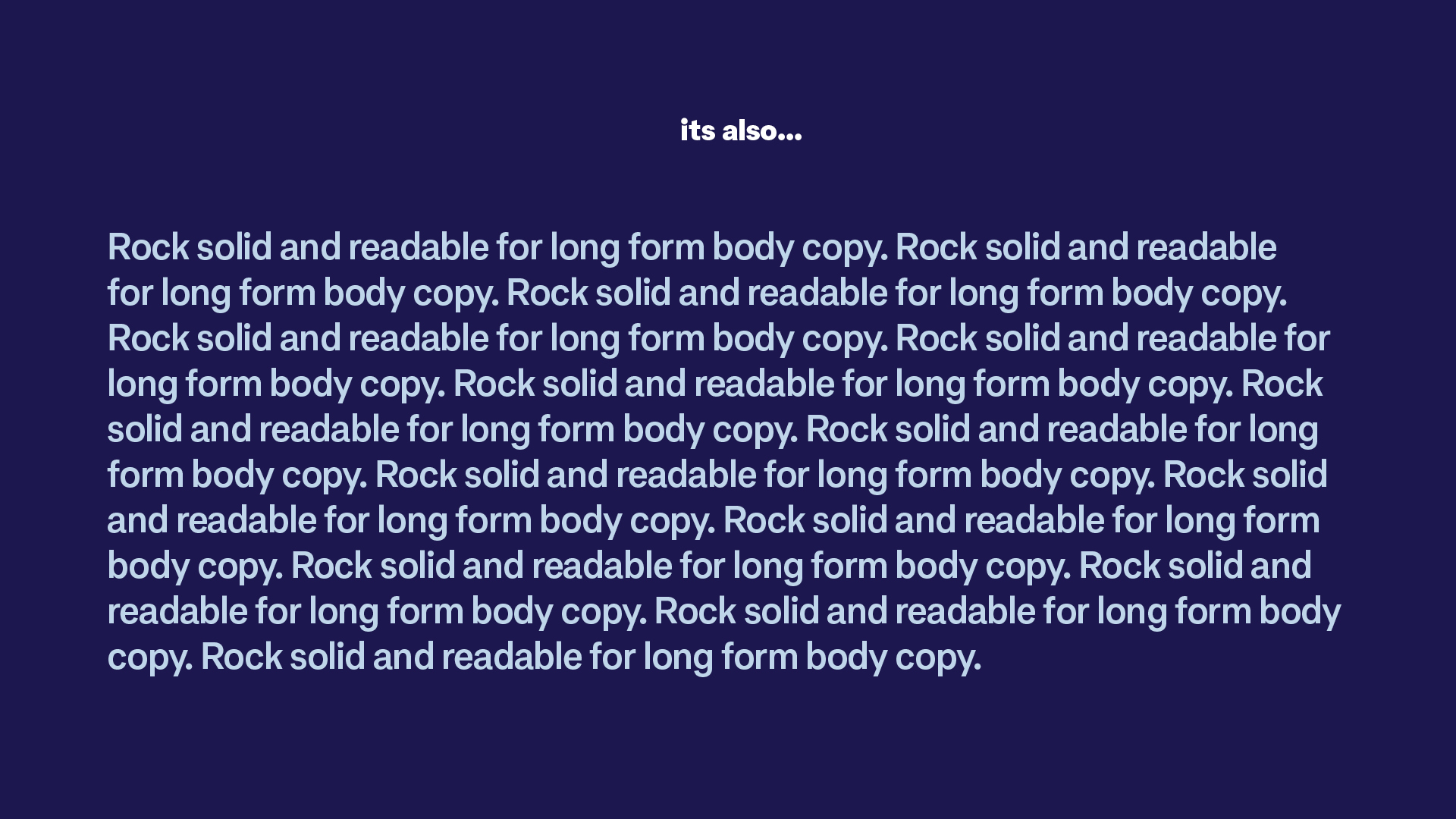
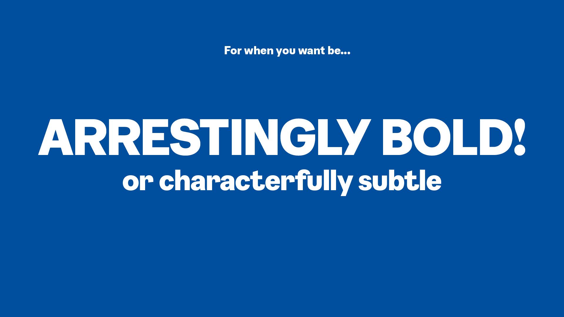
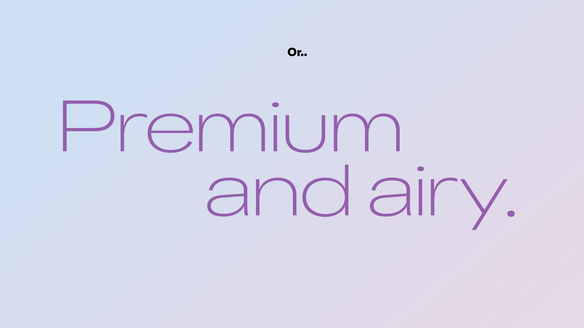
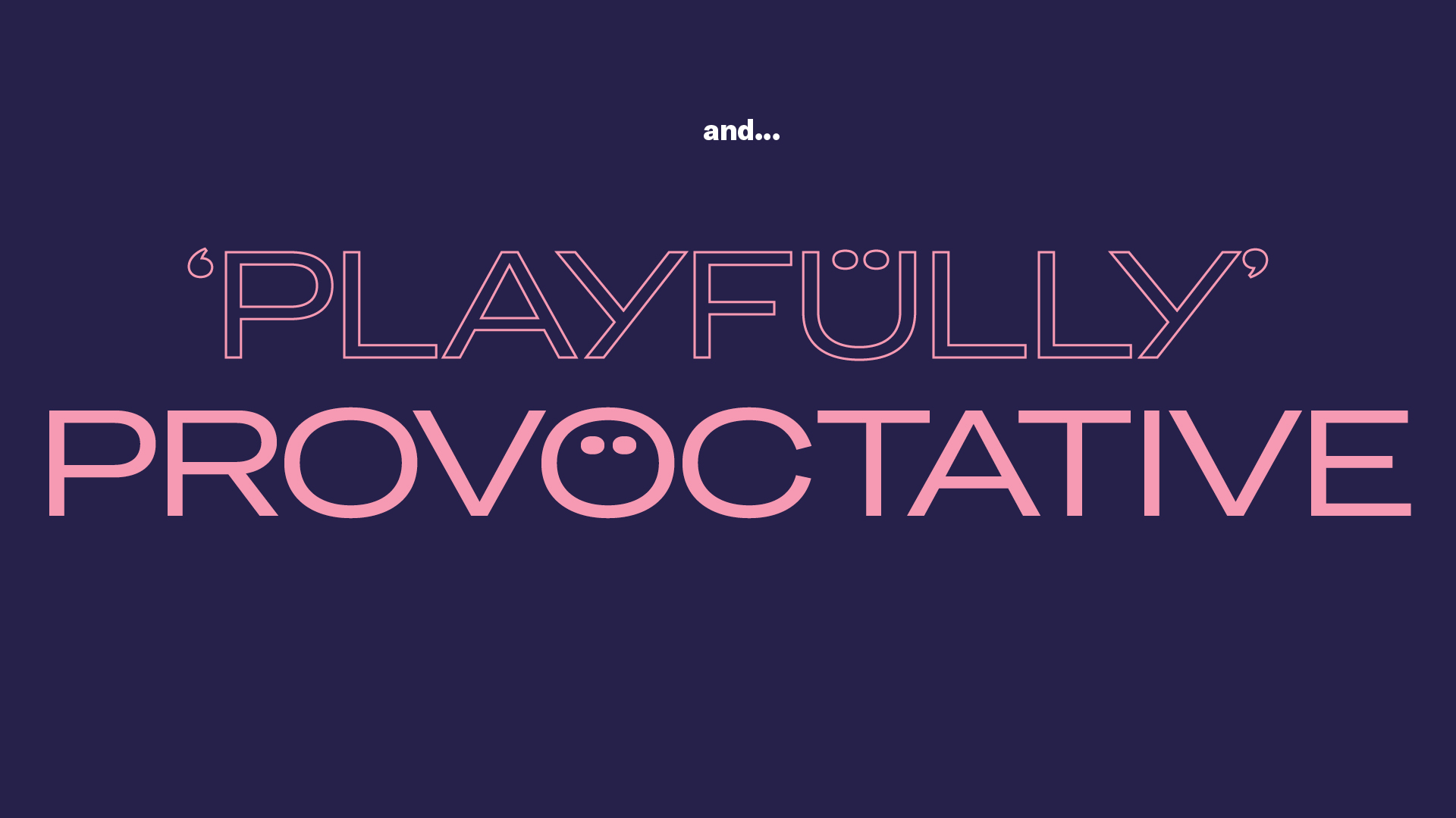
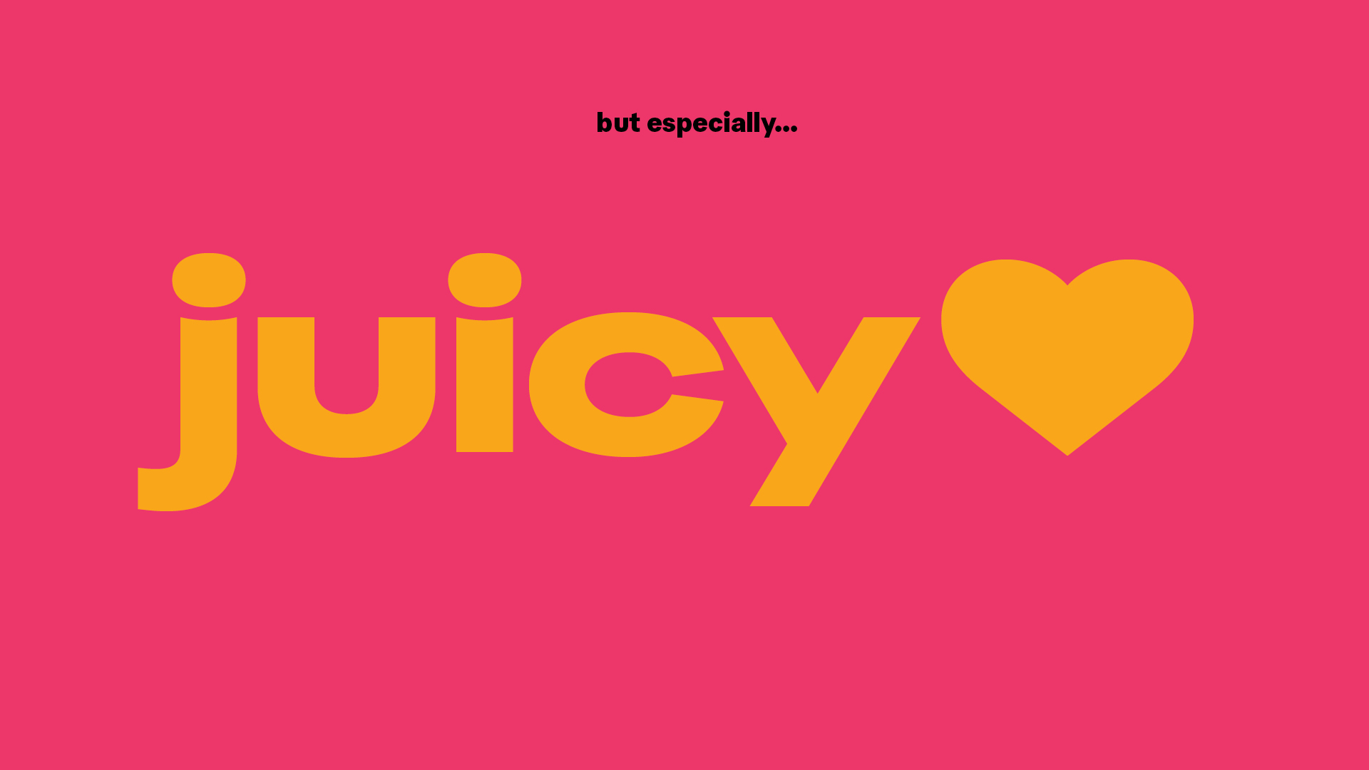
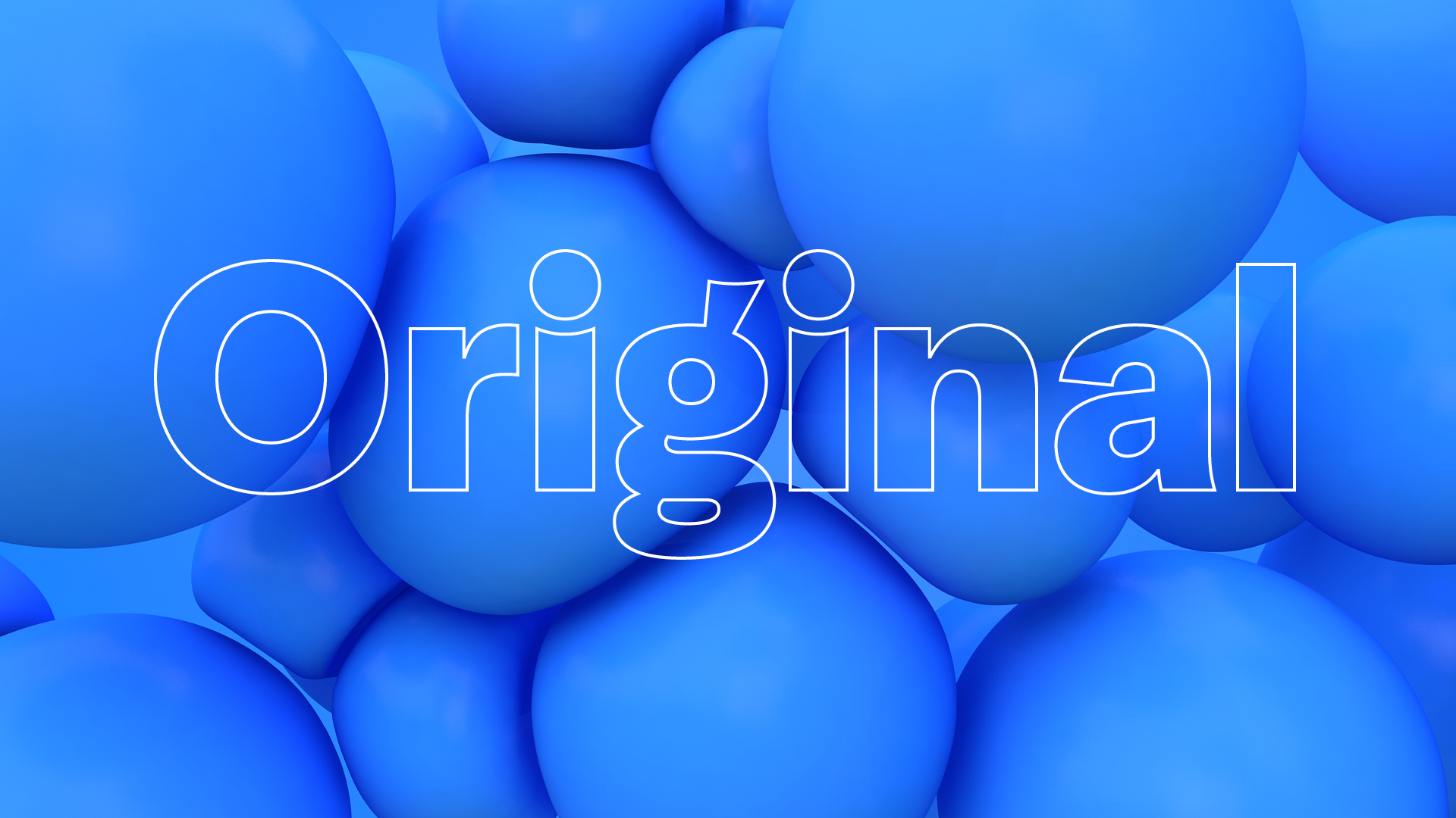
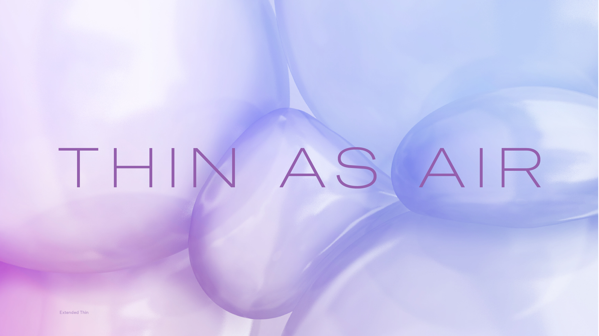
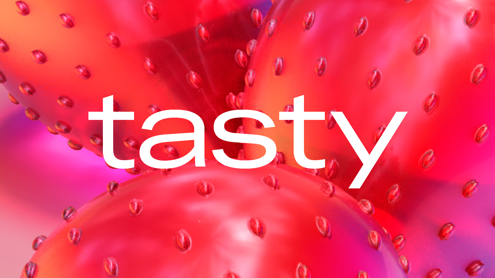
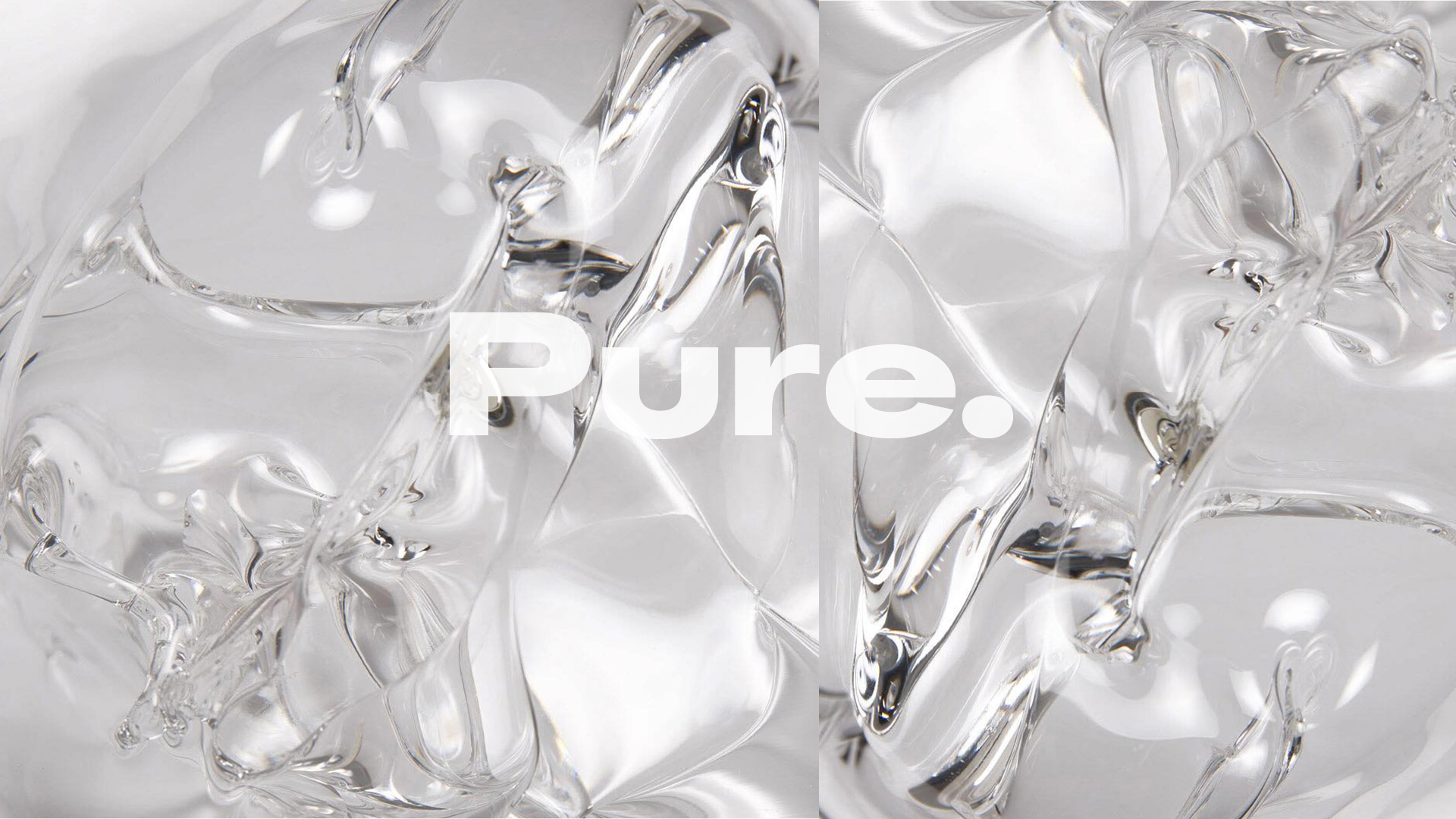
We worked with Colophon Foundry to develop a new typeface that fit Durex new brand approach, the super family featured 11 weights that could speak flex across the brand.
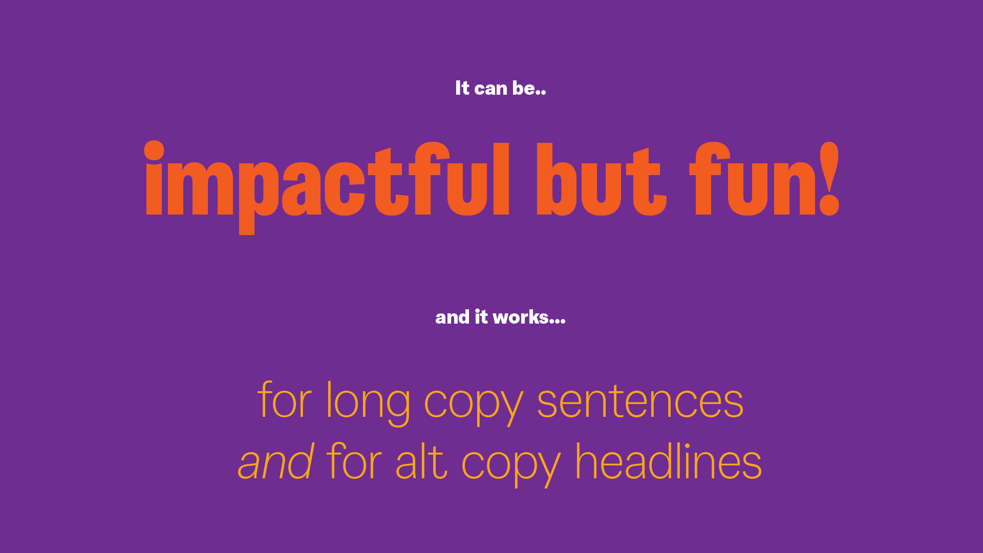
For example to be more refined when sitting in the context of NHS communications, but then be able to dive into a youthful edge at Durex activations at the likes of Sonar festival.
FULL CASE STUDY COMING SOON
We worked with Colophon Foundry to develop a new typeface that fit Durex new brand approach, the super family featured 11 weights that could speak flex across the brand.
For example to be more refined when sitting in the context of NHS communications, but then be able to dive into a youthful edge at Durex activations at the likes of Sonar festival.
FULL CASE STUDY COMING SOON


Agency
Creative Director
Art Direction
Type Development
Creative Director
Art Direction
Type Development
Havas London
Lorenzo Fruzza
Kieran Mistry
Nik House
Colophon Foundry
Lorenzo Fruzza
Kieran Mistry
Nik House
Colophon Foundry